Lakes Area Web Design
A resort town business does not have a slow season. It has a closed one. That one fact changes what its website has to do, so this site is built around it rather than around a town name.
The thing everybody gets wrong about resort businesses
A resort, an outfitter or a lake bar earns most of its year between Memorial Day and the first week of October.
The bookings that fill those months are made in February and March. From a laptop several hundred miles away. By somebody comparing three places they have never been to.
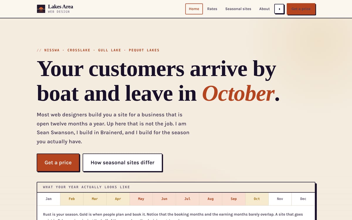
So the earning months and the buying months barely overlap. Almost every small business website is built as though they do. That gap is the whole point of this site, and the home page opens with a twelve-month strip showing it, because it is faster to see than to read.
What that changes about the build
A site for a seasonal business has to keep selling while the business is shut. The worst thing it can do is read as closed in January, which is exactly when next summer is being planned.
So the pages hold rates, dates and a booking enquiry for a season that has not started yet, and say plainly what is open and when.
Five pages: home, rates, a page on how seasonal sites differ, about, and contact. The rates page shows the fixed price and what decides it, the same way my other sites do. It also says to book the build in March rather than the week before the season starts. A site delivered in June has already missed most of what it was for.
A fourth design, checked rather than assumed
This is the third local site I have built, and it shares zero class names with the second one.
I checked that with a diff rather than by eye. Two sites can look different and still be the same document underneath, and the markup is what gives a template farm away.
Dusk plum and rust on warm bone. Fraunces and Karla. Squared corners with hard offset shadows, and a low sun that belongs to a lake in October. The only line the two stylesheets share is a generic reset.
The bug worth writing down
The social card came out in the wrong typeface, and nobody would have spotted it in the code.
Fraunces installs under the family name “Fraunces 144pt”. So asking for “Fraunces” in an SVG quietly falls back to a default sans, and still renders a perfectly clean image at the wrong width.
Nothing errors. Nothing logs. The only way to catch it is to look at the finished picture, or to check the font name resolves before you render anything with it.
I now check that every time, on every project. A silent fallback that produces valid output is the worst kind of bug there is.