Halcyon Yoga
Twenty-one pages for an invented Edinburgh yoga studio, built around one job the site has to do: get a stranger booked into their first class.
Concept build. Nobody commissioned this. I built it to show what the work looks like for this kind of business, and everything in it — the name, the prices, the photographs — is made up for that purpose.
What it is
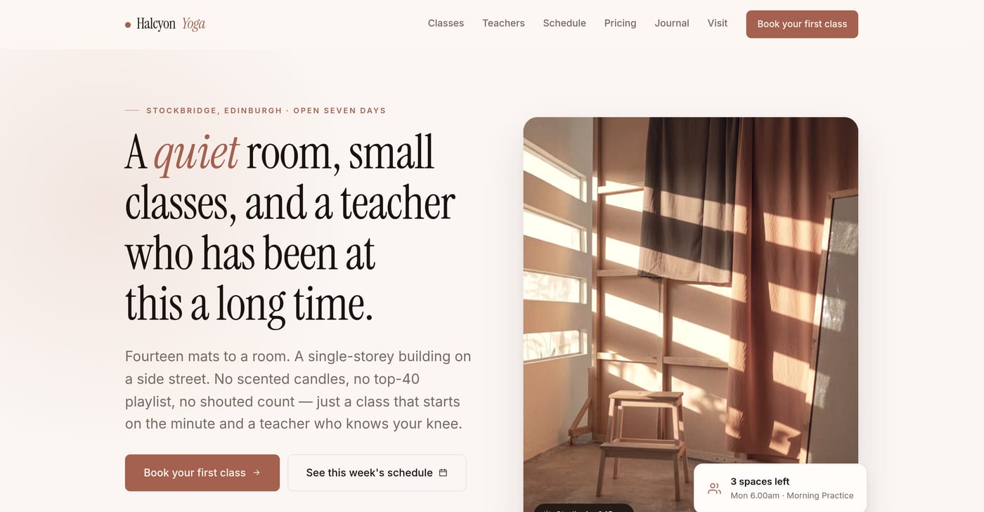
A boutique yoga studio in Stockbridge, Edinburgh, that does not exist. Fifteen public pages, five admin pages and a 404. Three class descriptions, five teacher profiles, a timetable, pricing, a visitor guide and seven long journal essays. About fourteen thousand words, all written for this project.
A studio is a good test because the category is full of sites that look expensive and do nothing. Soft photos, a nice typeface, then a phone number at the bottom and no way to actually get into a class.
The one job
The whole site is arranged around getting somebody onto a mat. I made that testable rather than aspirational. Three rules, each held up by a test that runs against the built pages.
Every main button leads to the booking flow. Before that rule existed, three pages had an email enquiry as their loudest action. That is the exact failure the category is full of.
No page is a dead end. Every page, the 404 included, offers a route to booking from inside its own content, not just from the header. The 404 failed this and had to be rebuilt as a recovery page.
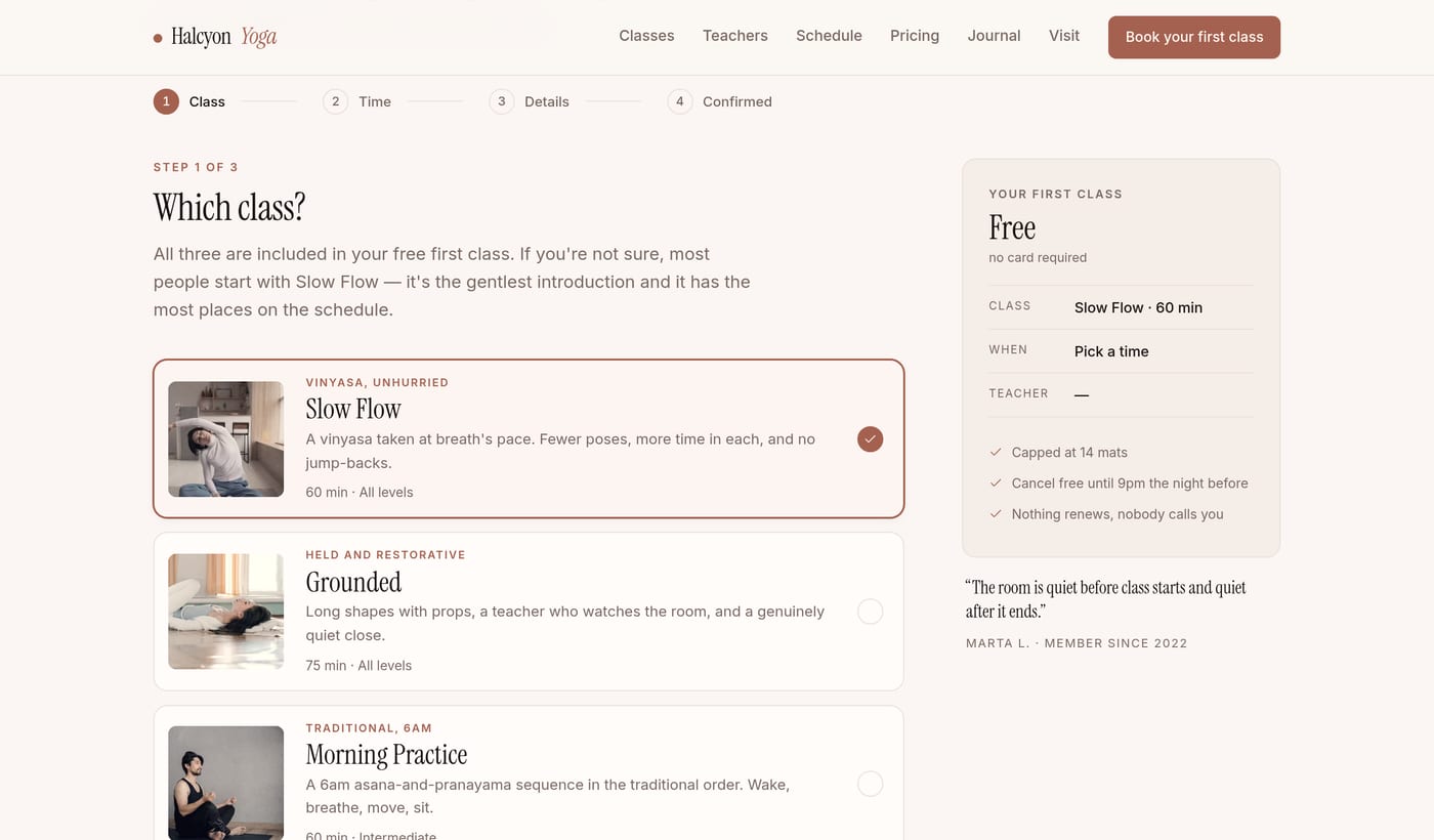
Intent carries. Pick a class and the flow opens at step two with that class chosen. Pick a time from the timetable and it opens at step three. All thirty-one slots carry their own link. Nobody is asked the same question twice.
The flow is four steps that ship as a single document. Switch JavaScript off and you get one readable form rather than a blank page. It ends in a confirmation and a calendar file. Nothing is submitted anywhere, and the page says so at the point where a real one would take your details.
The back office
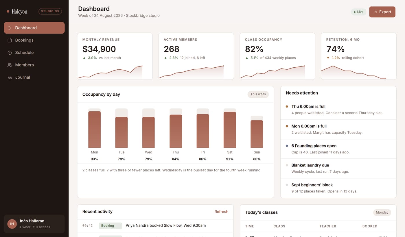
Five admin pages: dashboard, bookings, schedule manager, members and a journal editor. They read the same data the public site reads.
Change one file and the timetable updates everywhere. The homepage teaser, the schedule page, the admin week board, the teacher-load table, and the counts written into the prose around them.
That shared model is most of what separates an expensive-looking site from a fragile one. It is also the argument for a generator rather than twenty-one hand-written pages.
The photography problem
Stock photos come from a dozen photographers under a dozen lighting setups. A page of them looks exactly like what it is.
So every source photo runs through one shared grade during the build. Saturation pulled down so loud props stop shouting. A warm push toward the studio’s clay color. A soft terracotta wash. A film grain that comes out the same every time.
Framing is declared rather than automatic. Each image can carry its own crop, and the width budget is measured against that crop, so a tighter frame never quietly costs sharpness. The overhead shot became hands pressing into a wood floor. The one frame with a mural in it was dropped rather than carried.
Where a photo would only be filler, the build makes abstract light studies instead. The teachers are shown as generated tiles and initials. They are invented people, and a real face would be a claim about somebody who never agreed to it.
What it measures
First contentful paint of 224 ms on the homepage. Cumulative layout shift of 0.000 on every page. Both measured in headless Chromium against the production headers.
Ten requests for the homepage. No render-blocking CSS. About 17 kB of JavaScript across the public site, roughly half of it the booking flow, loaded only there.
The stylesheet is written into every page rather than fetched, which is why first paint never waits on a round trip. Every image ships with its real dimensions and a blurred placeholder. Every web font has a local fallback matched to its metrics. That is why the layout shift figure is a zero rather than a small number.
Checking it took forty-six tests plus a per-page audit. No console errors. No failed requests. No dead internal links. One h1 per page. Alt text everywhere. No sideways scroll at six widths from 320 px up.
Two things that would have shipped broken
The stylesheet was first deferred using an inline onload handler. The site’s own content security policy blocks inline script, so every page would have arrived in production with no styling at all.
It was caught because the local preview server replays the production headers rather than serving files plainly. A security policy you never test against is decoration.
Then adding a package.json flipped the Vercel project from a static deploy to a framework build, which failed looking for an output folder that does not exist. The fix was to tell the host plainly that there is no build step, because the generator writes finished HTML into the repository root. Nothing to configure on deploy is the point of building it that way.
A closer look